Inukshuk Brand Identity
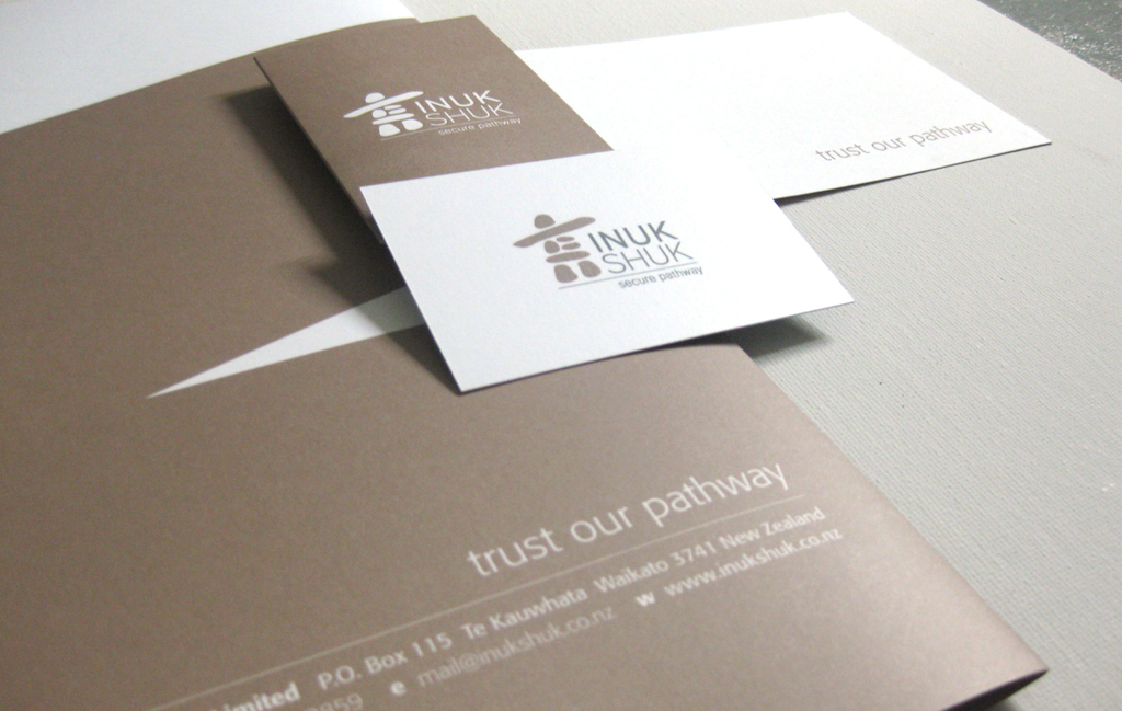
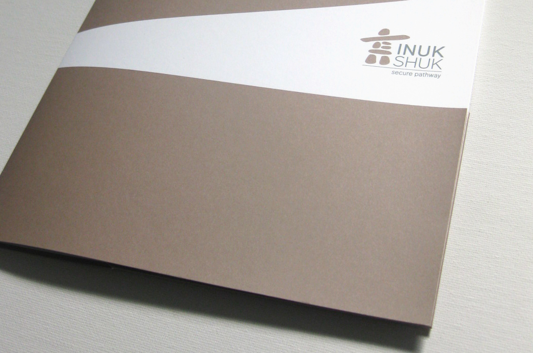
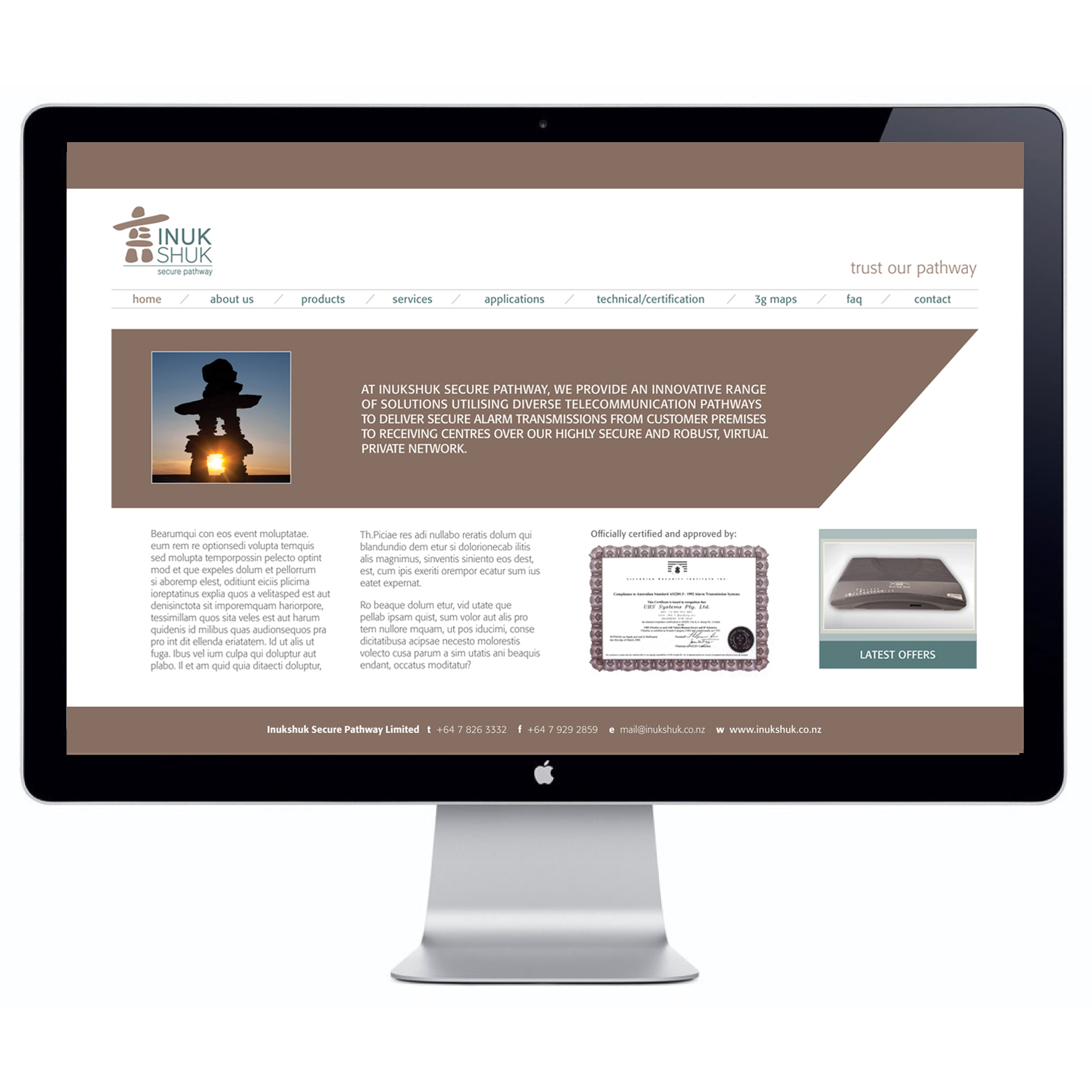
Inukshuk Brand Identity Inukshuk Secure Pathway provide technical and operational requirements of the security industry to deliver secure alarm systems and telecommunication pathways to their clients. The client wanted to use an inukshuk as an element in their identity to represent the safe and secure telecommunication pathways they provide, as an inukshuk is a symbol of ‘safe pathways’ and a marker to guide people in the right direction. It symbolizes Inukshuk’s service. I chose a muted and earthy look and colour palette to establish that that Inukshuk are a trusted, down-to-earth brand and the strong directional lines to denote the guidance they offer. I designed the brand identity and website look and feel for this brand. *Freelance whilst at UGP Design


Brand Identity